Analyzing learning rates (pt. 1): Common pitfalls

TL/DR
- When comparing learning rates across groups (i.e., experimental conditions), it is important to consider how much learning occurred from start to finish AND when that learning occurs.
- Common approaches like comparing performance in the 1st and 2nd half of trials or comparing linear trends can give distorted results because they fail to consider both how much learning occurs and when it occurs
We often care how individuals’ behavior develops over time or with experience. In accounting, perhaps the most obvious example is learning: How do individuals improve their performance as they gain experience and receive performance feedback (e.g., Berger 2019; Choi, Hecht, Tafkov, and Towry 2020; Kelly 2007; Sprinkle 2000; Thornock 2016). This seems like a simple enough question to test: is behavior in the later trials of the task different from behavior in earlier trials? But what is early and what is late? And should we compare early and late, or should we calculate some rate of change such as a linear slope? Based on what I have learned from my own experiences,1 making statements about learning curves is far from straightforward. While many readers may already be familiar with the pitfalls and difficulties, hopefully this blog post explicitly outlines the key issues we face when examining and comparing learning curves.
Comparing two learning curves
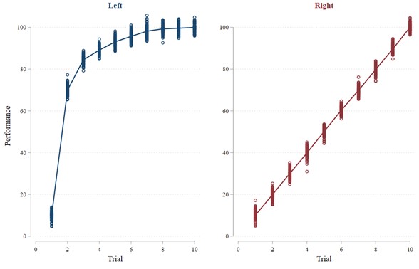
Let us start with some simulated data, which you can access yourself here.2 Consider the two patterns of results shown in the Figure 1 graphs. These graphs show a scatter plot of the data. The vertical bars consist of circles that represent each data point. The lines running through the data points are estimates of the learning curves using locally smoothed regressions (understanding how these regressions work is not important for our purposes, all that matters is the visualization of the learning curve).
The most important thing to notice is that the blue learning curve on the left represents better learning than the red learning curve on the right. Both curves rise about the same total amount from start to finish (i.e., trial 10 versus trial 1). However, the blue curve rises much more quickly. Therefore, individuals in both graphs end up at the same level of performance after 10 trials. However, the individuals in the blue graph on the left get there much more quickly. We can also see that the blue learning curve is non-linear. This non-linearity is what gives us trouble with the commonly used tests we often see, as I discuss next.
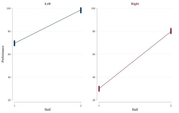
So our eyes tell us that learning is better with the blue curve on the left. However, will our statistical tests bear that out? First, let us try the idea of comparing later performance with earlier performance. In this case, we will use average performance in the 2nd half of the trials (trials 6 through 10) as the “later” performance and average performance in the 1st half of the trials (trials 1 through 5) as “earlier” performance. Contradicting what our eyes tell us, the results from this test (shown in Figure 2) suggest that there is better learning with the red curve on the right than with the blue curve on the left: Performance with the left curve increases by 29.2 from the 1st to the 2nd half whereas performance with the right curve increases by 49.9 from the 1st to the 2nd half. The difference is significant (t-stat = 119.50; p < 0.001).3 Okay, our common sense suggests that the blue learning curve in Figure 1 exhibits better learning than the red one, but the statistical test suggests the opposite.
Let us try something else. This time, we will compare the linear trends by regressing performance on the trial number for the left and right graph separately.4 This test gives us the same odd result as the previous one: Estimated learning (i.e., the coefficient on the trial number) is 6.8 with the blue curve on the left but 9.9 with the red curve on the right. The difference is again significant (t-stat = 105.29; p < 0.001).
What is going on? How can both of our statistical tests say there is better learning with the red curve on the right when there is clearly faster learning with the blue curve on the left?
How Much Learning and When?
Many of you might already realize the issue. But let’s break it down. As stated previously, performance on the left and right is pretty much the same in trial 1 and trial 10. This means that the overall amount of learning–the magnitude of total improvement from beginning to end–is roughly the same in both cases. So what is different? The difference lies in WHEN that learning takes place. Learning occurs much sooner, or more quickly, in the left graph than in the right graph. The two statistical tests we have tried thus far are not good at accounting for WHEN the learning occurs. When learning occurs quickly but then flattens out, the early versus later and linear trend tests become highly distorted.
Consider the “later” versus “earlier” test. Because learning happens so quickly with the learning curve on the left, most trials in the 1st half look similar to the trials in the 2nd half. In other words, the more quickly learning occurs, the more similar the 1st and 2nd halves look. However, with the learning curve on the right, the learning happens steadily, so performance in the 1st half looks quite different from performance in the 2nd half.
We could try to account for when the learning occurs by using different windows of early and late. However, this brings up the previously mentioned issue with this test: what is early and late? The choice is arbitrary. Moreover, in this case, it will not matter much. We can also compare smaller subsets of trials, such as the 1st trial versus the 10th trial, but that entirely ignores when the learning occurs and only considers how much total learning occurs. Looking at small subsets of trials can also reduce power when performance in any one trial contains substantial noise that could be smoothed out by taking averages across trials. We can obtain a result that makes the left look better by comparing trial 1 to the average of trials 2 through 10. This might be appropriate, but it is important to acknowledge the subjectivity inherent to that approach and that the window was chosen ex post. Perhaps most importantly, the “correct” subset of trials to use might differ across groups, or one group might appear to have learned better than another when making comparisons with one subset of trials but not when making comparisons with another subset of trials.
What about our test of linear trends? This faces a similar but different problem. The main issue with the linear analysis is that, with the left graph, the regression has a choice: it can have a high slope and fit the early trials well, or it can have a flat slope and fit the later trials well. How does it resolve this choice? It takes a weighted average, and because the line is relatively flat for most of the trials, the regression ends up with a flatter line. As a result, learning that occurs quickly does not result in a high slope; rather, it results in a high intercept! This results in the regression fitting a much higher intercept for the red curve on the left than for the blue curve on the right. In fact, with non-linear curves, where much of the change in performance is concentrated within a few trials, the regression will not pick up such learning. Instead, the regression will choose a flatter slope with an intercept that closely matches the flatter portions of the curve.
The main lesson from these examples is that it is critical to consider both the overall amount of learning (difference from the beginning to the end) AND when that learning occurs (early versus late). Notably, the example used throughout this post is not simply a stylized example that would never occur in reality. Rather, aggregated learning curves are almost always non-linear, exhibiting diminishing returns to experience that make them concave (Argote and Epple 1990; Donner and Hardy 2015; Gallistel, Fairhurst, and Balsam 2004; Wright 1936).5 Thus, it is not only about the total learning, but also about how quickly people traverse the learning curve (i.e., how concave the learning curve is). Accordingly, in most practical situations, the simple methods outlined here (i.e., comparing later to earlier performance or comparing linear trends) will not work well because they do not account for WHEN the learning occurs. In part 2 of this blog post, I discuss other methods that can work better, but which also present their own unique challenges.
References
How to reference this online article?
Yes, that is a bad pun.↩
All the code used for this post can be found here: https://github.com/jzureich21/ComparingLearningCurves.git.↩
Significance tests are a little silly with simulated data, where I could just set the error term to zero to give any observed differences a p-value of 0. But I use them for illustrative purposes.↩
Of course, this is similar to regressing performance on trial number, an indicator variable for the graph (left or right), and the interaction between the two.↩
Note that throughout this blog post I have discussed a setting in which performance increases are represented at higher values on the y-axis. However, in other cases, performance improvements might instead be represented by decreases along the y-axis, e.g., a decreasing rate of product defects or production time as employees gain experience with the production process. In those cases, the learning curve is typically decreasing convexly (initial sharp decreases followed by a flattening out). All the ideas are equivalent in those cases. In fact, performance could simply be multiplied by negative one to convert a convexly decreasing learning curve into a concavely increasing curve, or vice versa.↩